
Some daily price projections can be found for MNQU23 at the bottom of this post!
Please watch the entire video to understand the concept. I will try to put into words briefly what the charts mean so you can grasp the concept. If you have questions, leave them in the comments and I will answer them.
“What The Hell Is That?”
Volume profile analysis seems strange, but it has been studied since the 1950s and has been routinized in software and trading algorithms today. Peter Steidmayer created the concept and has written a few books on the subject. At first, you might think of it as strange like Bill Murray and Steve Martin would in this classic SNL skit.
The basic concept to look at markets a way an auctioneer might considering where a center point of market action is, and determining where future supply and demand areas are.
Traditionally, charts plot volume on the horizontal axis as this chart is (taken from jumpstarttrading dot com to make it easier to see). I don’t endorse the product, but the diagrams are better than with the material I was given to work with when I learned how to use my platform.
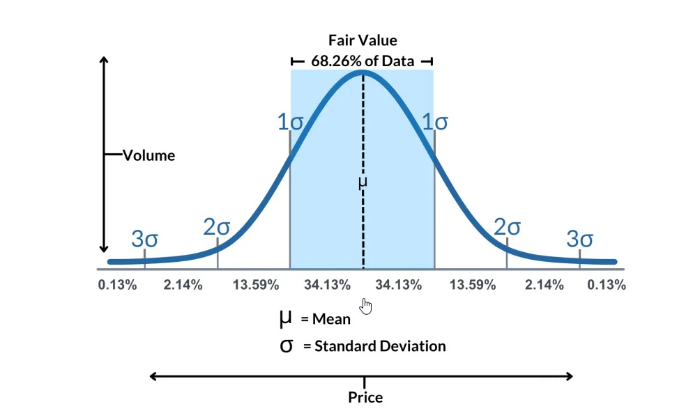
Over a given time frame, as mentioned in the video (50 hours as it is presented in the video, which would be the equivalent of 50 periods in any time frame (1-minute, 5-minutes, 30-minutes, etc.), a distribution of trading that is very close to a normal distribution of volume action occurs. Most of that volume stays within 1 standard deviation of that mean value, the mean value being the volume-weighted average price (VWAP). When there is not buying or selling pressure applied to push price beyond that space of 1 standard deviation moves, price action will remain inside that area. When it does not, price will begin to seek other levels for which there will be new price equilibrium. You may be asking yourself “What the hell is that”? to answer that question, let’s turn that chart on it’s side.

What you see here is a volume profile image that shows how much VOLUME trades at each PRICE LEVEL. If you see the horizontal VWAP control point, which I call a VWAP line, you get a proper idea of where price settles for buyers and sellers. The longer the horizontal line, the more volume is traded at THAT PARTICULAR PRICE (since the lines are spaced to capture the volume around it, the VWAP price might be a bit askew of the tick count. That is why I round them in those daily price analysis post.
Now lets see what that tells us as far as price movement. This is going to be quite basic, but I will revisit it again soon when we deal with interactions between price and volume.
How this is presented on the TradeStation platform.

You can click on that chart to expand the size. For now, I want you to focus on the dots, red teal and blue (on the far right candlestick bar, the teal dot is covered, but it is there just to the left of that far right candlestick bar). Those dots, green and red represent unfair lows and unfair highs (in the midst of that 2 standard deviation distribution). What you will often notice is that two of those three sets of dots will be close together. If red and teal are close together, there is significant potential resistance near those levels, and if green and teal are together, there is substantial support.
If buyers create a price imbalance, and price moves above that red dot, odds are high that there will be a significant price move ABOVE the unfair HIGH to some new distribution level, and if prices are at all time highs you would see an aggressive move to even newer highs until volume exhausted itself.
If sellers create a price imbalance ( to the downside), and price moves below the green dot, odds are high that there will be a significant price move BELOW the unfair LOW to some new distribution level, and if prices are at all time lows you would see an aggressive move to even lower lows until volume exhausted itself.
The amount of volume and the combination of volume and price momentum will determine how large those moves might be. What we will explore in future sessions is how those factors determine the size of a price move in either direction, and how a reasonable price TARGET can be created for any set of conditions.
I am going to stop here and let you study that. If you have any questions, leave them in the comments and I can answer them for you.
I have way too much on my plate, but the only new data I can plow out of charts that still look bearish for MNQU23 on the monthly chart can be found on the daily charts.
Here is the bullish projection (if buyers take the helm):

And if bears keep on selling, the bearish projection:

Which will it be? I have no idea. It all depends on who shows up on this Sunday evening and next week. Have a pleasant rest of your weekend. More content comes soon.
